display 속성
HTML 에서 요소를 어떻게 표시할 지 결정한다
블록요소 => display : block
인라인요소 => display : inline
none : 요소를 보이지 않게 설정한다
block : 블록요소로 설정한다
inline : 인라인요소로 설정한다
inline-block : 인라인 블록요소 설정한다
인라인처럼 컨텐츠만큼의 영역을 차지하지만
블록처럼 컨텐츠의 너비, 높이를 변경할 수 있다
내부 block요소, 외부 inline 요소의 특징을 갖는다
1. flex box
레이아웃을 만들 때 사용하는 속성
float
display의 flex box
grid
flexbox
레이아웃을 만드는 하나의 방식이다
복잡하지 않게 유연하게 요소들의 크기와 순서를 정하여 배치할 수 있다
flex box 구성
flex container
레이아웃을 적용하여 배치하려는 요소들을 감싸고 있는 부모요소
flex item
실질적으로 배치하려는 요소이며 flex container의 자식요소이다
자식요소인 flex item은 여러개 만들 수 있다
주축(main axis)
자식요소가 배치되는 방향
교차축(cross axis)
주축을 가로지르는 방향
flex container 만들기
컨테이너로 사용할 부모 요소에 display : flex 속성을 지정한다
flex container의 주요 속성
배치하려는 요소들의 전체흐름, 정렬과 관련된 속성
display
display: flex
flex container를 지정하는 속성
flex-direction
flex-direction : row | column;
주축의 방향을 지정하는 속성
row => 행 방향
column => 열 방향
justify-content
컨테이너 주축을 기준으로 아이템들을 정렬한다
center 중앙정렬
space-between 첫아이템과 마지막 아이템을 컨테이너 영역의 양 끝에 배치하고
나머지 아이템들은 동일한 간격으로 정렬된다
마진이 없으면 완전히 끝으로 붙는다
space-around 모든 아이템을 동일한 간격으로 정렬한다
align-itmes
컨테이너의 교차축을 기준으로 정렬한다
center
space-between
space-around
flex-wrap
컨테이너 내부의 요소들이 많거나 크기가 커서 컨테이너를 넘어가게 되었을 때
한줄로 보여줄것인지, 여러줄로 보여줄것인지 지정한다
nowrap :flex-wrap의 기본값, 줄바꿈을 하지 않고 한줄로 보여준다
만약 컨테이너의 크기가 작다면 각각의 아이템의 크기가 줄어든다
wrap : 컨테이너의 크기가 작다면 여러줄로 보여준다
flex item의 속성
배치하는 각각의 자식 요소의 순서, 크기 등의 속성 지정
flex
flex-grow 아이템이 남은 공간을 얼마나 확장할 수 있는지 나타냄
값이 클수록 남은 공간을 더 많이 차지함
flex-shrink 아이템이 공간 부족할때 얼마나 축소할 수 있는지 나타냄
값이 클수록 더 많이 축소 가능
flex-basis 아이템의 초기 크기를 설정함
아이템의 크기를 결정하는 기본값으로 사용(단위 px, %)
등등 있으나 활용도가 높지 않다
2. semantic 태그
태그 자체적으로 의미가 있는 태그
시멘틱태그의 종류
<header> 페이지의 헤더 영역, 최상단에 위치함
<footer> 회사 정보등을 담은 푸터 영역, 최하단에 위치함
<nav> 다른 페이지로 이동하는 요소를 담은 네비게이션 영역
<main> 주 컨텐츠가 들어가는 영역
<aside> 주 내용과는 연관성이 낮은 분리된 영역, 주로 사이드바로 사용
<section> 컨텐츠간의 영역을 나눌 때 사용
<article> 독립되고 반복적으로 재사용가능한 컨텐츠 영역
<!DOCTYPE html>
<html lang="en">
<head>
    <meta charset="UTF-8">
    <meta name="viewport" content="width=device-width, initial-scale=1.0">
    <title>flex 에제</title>
    <style>
        .container{
            width: 700px;
            height: 300px;
            border: 1px solid black;
            display: flex;
            /* 부모요소에 flex 지정  flex 안에서 자식들의 margin 은 겹쳐지지 않음*/
            flex-direction: column;
        }
        .item{
            width: 100px;
            height: 100px;
            border: 1px solid blue;
            background-color: skyblue;
            border-radius: 10px;
            margin: 10px;
        }
    </style>
</head>
<body>
    <div class="container">
        <div class="item">item 1</div>
        <div class="item">item 2</div>
        <div class="item">item 3</div>
        <div class="item">item 4</div>
         <div class="item">item 5</div>
    </div>
</body>
</html>
-display: flex 실습 부모요소에 flex 와 direction 지정
<!DOCTYPE html>
<html lang="en">
<head>
    <meta charset="UTF-8">
    <meta name="viewport" content="width=device-width, initial-scale=1.0">
    <title>Document</title>
    <style>
        *{
            margin: 0;
            padding: 0;
        }
        .main-container{
            border: 3px solid black;
        }
        .header{
            background-color: blanchedalmond;
            height: 120px;
        }
        .section{
            background-color: blueviolet;
            height: 480px;

        }
        .footer{
            background-color: orange;
            height: 120px;
        }
    </style>
</head>
<body>
    <div class="main-container">
        <div class="header">header</div>
        <div class="section">section</div>
        <div class="footer">footer</div>
    </div>
</body>
</html>
-시멘틱 테그의 영역 보기
<!DOCTYPE html>
<html lang="en">
<head>
    <meta charset="UTF-8">
    <meta name="viewport" content="width=device-width, initial-scale=1.0">
    <title>Document</title>
    <style>
        *{
            margin: 0;
            padding:0;
        }
        .header{
            background-color: antiquewhite;
            height: 100px;

        }
        .footer{
            background-color: antiquewhite;
            height: 100px;
        }
        .section-container{
            background-color: black;
            height: 500px;
            display: flex;
            justify-content: space-between;
        }
        .aside{
            background-color: blueviolet;
            height: 100%;
            /* %단위는 부모 요소 크기의 퍼센트를 의미 */
            width: 200px;
        }

        .section{
            background-color: brown;
            height: 100%;
            width: 100%;
            flex-grow: 1;
            /* 나머지 공간 차지하도록 설정  */
        }
    </style>
</head>
<body>
    <div class="name">
        <div class="header">header</div>
        <div class="section-container">section-container
            <!-- 단어가 나올 공간이 필요해서 100% 로로 with 둬도 안없어질수 있음  -->
            <div class="aside">asized</div>
            <div class="section">section</div>
        </div>
        <div class="footer">footer</div>
    </div>

</body>
</html>
-시멘틱 테그 영역보기 ,container 안의 자식요소 aside,section 의 크기 width 는 전체 크기가 아니라 부모 요소에서 몇%를
차지할지를 의미함. 여기서는 부모 요소에 text가 있음으로 100% 로 둬도 text 공간을 확보하기 위해서 100%로 width 가 차지되지 않음.
<!DOCTYPE html>
<html lang="en">
<head>
    <meta charset="UTF-8">
    <meta name="viewport" content="width=device-width, initial-scale=1.0">
    <title>Document</title>
    <style>
        *{
            margin: 0;
            padding:0;

        }

        .header{
            background-color: antiquewhite;
            height: 100px;

        }
        .footer{
            background-color: antiquewhite;
            height: 100px;
        }
        .section-container{
            background-color: black;
            height: 500px;
            display: flex;
            justify-content: space-between;
        }
        .aside-B,
        .aside-A{
            background-color: blueviolet;
            height: 100%;
            /* %단위는 부모 요소 크기의 퍼센트를 의미 */
            width: 200px;
        }
        .aside-B{
            background-color: blue;
        }

        .section{
            background-color: brown;
            height: 100%;
            width: 100%;
            flex-grow: 1;
            /* 나머지 공간 차지하도록 설정  */
        }
    </style>
</head>
<body>
    <div class="name">
        <div class="header"></div>
        <div class="section-container">
            <div class="aside-A"></div>
            <div class="section"></div>
            <div class="aside-B"></div>
        </div>
        <div class="footer"></div>
    </div>

</body>
</html>
.class, .class 로 두개 class 에 동시에 style 줄 수 있음
-felxt-grow :1 여백을 차지하게 된다.
<!DOCTYPE html>
<html lang="en">
<head>
    <meta charset="UTF-8">
    <meta name="viewport" content="width=device-width, initial-scale=1.0">
    <title>Document</title>
    <style>
        *{
            margin: 0;
            padding: 0;
        }

        .footer,
        .header{
            height: 100px;
            background-color: black;
        }

        .section{
            height: 500px;
            background-color: salmon;
        }

        .header--contents{
            height: 70px;
        }

        .nav-list{
            background-color: cadetblue;
            display: flex;
            list-style-type: none;
        }

        li{
            /* border: 1px solid white; 확인용 */
            width: 80px;
            font-weight: bold;
            text-align: center;
            height: 30px;
            line-height: 30px;
        }

        a{
            text-decoration: none;
            color: white;
        }
    </style>
</head>
<body>
        <div class="header">
            <div class="header--contents">
                <!--nev 바 말고 로고 등의 다른 컨텐츠 들어갈 공간-->
            </div>
            <div class="nav">
                <ul class="nav-list">
                    <li>
                        <a href="">HOME</a>
                    </li>
                    <li>
                        <a href="">상품목록</a>
                    </li>
                    <li>
                        <a href="">상품등록</a>
                    </li>
                    <li>
                        <a href="">주문내역</a>
                    </li>
                    <li>
                        <a href="">회원정보</a>
                    </li>
                </ul>
            </div>
        </div>
        <div class="section">

        </div>
        <div class="footer"></div>

</body>
</html>
-ul 에 flex 적용 li 아이템 정렬
<!DOCTYPE html>
<html lang="en">
<head>
    <meta charset="UTF-8">
    <meta name="viewport" content="width=device-width, initial-scale=1.0">
    <title>semantic01</title>
    <style>
        *{
            margin:0;
            padding:0;
        }
        header{
            height:100px;
            background-color: tomato;
            color: white;
            font-size: 30px;
            display: flex;
            flex-direction: column;
            align-items: center;
        }

        .header--text-box{
            height: 50px;
        }

        nav{
            height: 50px;
            background-color: steelblue;
            font-size: 20px;
            width:100%;
        }

        ul{
            display: flex;
            list-style-type: none;
        }
        li{
            /* border: 1px solid white; */
            /*테두리는 확인용 */
            height: 50px;
            line-height: 50px;
            margin: 0 10px;
        }
        .main-container{
            display: flex;
            height: 500px;
        }
        aside{
            background-color: brown;
            height: 100%;
            width: 200px;
            color: white;
            font-size : 30px;
            display:flex;
        }
        .aside--text-box{
            margin:auto;
        }
        main{
            height:100%;
            width:100%;
            background-color: gray;
            color:white;
            font-size:30px;
        }
        section{
            background-color: blueviolet;
            margin: 20px auto;
        }
        .section01{
            width: 40%;
            height: 30%;
        }

        article{
            background-color: skyblue;
            margin: auto;
            justify-content: center;
            align-items: center;
        }

        .section01--text-box{
            height: 20%;
        }

        .section01--article-container{
            display: flex;
            width: 100%;
            height: 80%;
        }

        article{
            display:flex;
            justify-content: center;
            align-items: center;
        }

        .section01--article{
            width: 100px;
            height: 60%;
        }

        .section02{
            width: 40%;
            height: 30%;
        }
        .section02--text-box{
            height: 20%;
        }
        .section02--article-container{
            display: flex;
            justify-content: center;
            flex-wrap: wrap;
            width:100%


        }
        .section02--article{
            width:40%;
            margin:10px;

        }

    </style>
</head>
<body>
    <body>
        <header>
          <div class="header--text-box">header</div>
          <nav>
            <ul>
              <li>nav 메뉴1</li>
              <li>nav 메뉴2</li>
              <li>nav 메뉴3</li>
              <li>nav 메뉴4</li>
            </ul>
          </nav>
        </header>
        <div class="main-container">
          <aside>
            <div class="aside--text-box">aside</div>
          </aside>
          <main>
            <div class="main--text-box">main</div>
            <section class="section01">
              <div class="section01--text-box">section</div>
              <div class="section01--article-container">
                <article class="section01--article">
                  <div class="article--text-box">article</div>
                </article>
                <article class="section01--article">
                  <div class="article--text-box">article</div>
                </article>
                <article class="section01--article">
                  <div class="article--text-box">article</div>
                </article>
              </div>
            </section>
            <section class="section02">
              <div class="section02--text-box">section</div>
              <div class="section02--article-container">
                <article class="section02--article">
                  <div class="article--text-box">article</div>
                </article>
                <article class="section02--article">
                  <div class="article--text-box">article</div>
                </article>
                <article class="section02--article">
                  <div class="article--text-box">article</div>
                </article>
                <article class="section02--article">
                  <div class="article--text-box">article</div>
                </article>
              </div>
            </section>
          </main>
        </div>
        <footer>
          <div class="footer--text-box">footer</div>
        </footer>
      </body>
    </html>
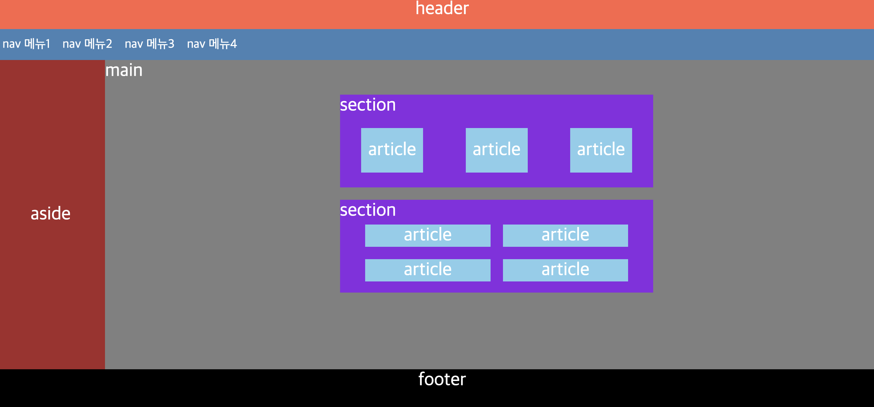
- 레이아웃 연습 결과물
'웹개발 기초 > html_css' 카테고리의 다른 글
| 가상선택자,transform,애니메이션,form (1) | 2024.02.12 |
|---|---|
| position , 고급선택자 (2) | 2024.02.12 |
| css 인라인 ,블록요소 ,박스모델 (0) | 2024.02.12 |
| img, a 태그, (3) | 2024.02.12 |
| html 기초 (2) | 2024.02.12 |